UI/UX Design: Bringing Interfaces to Life - Disney’s 12 Principles of Animation (Part 1)
Discover how Disney's timeless animation techniques can breathe life into digital interfaces. In this first installment of our two-part series, we explore the first six of Disney’s 12 Principles of Animation and show how they can make UI elements feel more responsive, intuitive, and engaging. Perfect for UX and interaction designers looking to elevate their craft with animation best practices.
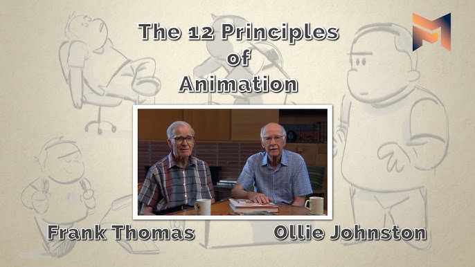
What are Disney’s 12 Principles of Animation?
When you watch a classic Disney movie, the characters move in ways that feel natural, even if they're talking animals or magical creatures. This makes you believe in them and care about what happens. Two of Disney's amazing animators, Ollie Johnston and Frank Thomas, wrote down 12 key ideas to achieve this "real" feeling. They called them the "12 Principles of Animation" in The Illusion of Life (1981). These ideas weren't just about making things look pretty; they were about making the animation tell a story and connect with the audience emotionally. Now, fast forward to today. We have all sorts of animations on our phones and websites – things that pop up, slide in, or change when we tap or swipe.
1. Squash and Stretch
In traditional animation, squash and stretch is all about conveying weight and flexibility. A classic example is a bouncing ball: as it falls and hits the ground, it squishes (flattens) on impact, then stretches as it rebounds upward. This change in shape gives the illusion of gravity and mass – a rubber ball will squash and stretch a lot, whereas a bowling ball hardly deforms at all. The key is that the object’s volume stays constant; when it squashes in one direction, it stretches in the other. In UI/UX design, squash and stretch translates into making elements feel more tactile and responsive. By subtly deforming UI elements during interactions, we create a sense of physicality as if the interface has real-world mass and elasticity.
2. Anticipation
In classic animation, anticipation is the setup that prepares the audience for a major action. For example, before a character jumps forward, they might shift backward, bend their knees, and swing their arms – a telltale pre-jump pose that lets you anticipate the coming leap. These preliminary moves cue the viewer’s brain for what’s about to happen next, making the action feel more believable and easier to follow. In UI and interaction design, anticipation helps users predict the result of their actions, improving usability. A common application is using small preparatory animations or visual hints to signal what will happen on the next interaction.
3. Staging
Staging in traditional animation (and theater/cinema) is about focus and clarity: arranging the scene so the audience’s eye is drawn to the right place at the right time. Animators use staging to ensure that the main action is unmistakably clear – for instance, a character’s pose and the framing of the shot direct your attention to what’s important in the scene. Any extraneous movement is minimized so it doesn’t steal the spotlight. Essentially, staging sets the stage (pun intended) for the viewer to understand the story moment by moment. Translating this to UI/UX design, staging is about using motion and layout to guide the user’s focus to key information or actions during transitions. In a digital interface, you might have many elements updating or animating at once, but staging reminds us to choreograph these changes so that the user isn’t overwhelmed.
Music Player
4. Straight-Ahead vs. Pose-to-Pose Action
Disney’s fourth principle actually describes two different animation techniques. Straight-ahead action means animating frame-by-frame from start to finish – you draw (or animate) one frame, then the next, and so on. This approach can lead to more spontaneous-looking motion, but it’s harder to control the exact outcome. Pose-to-pose, on the other hand, is a more planned method: you create the key frames (important positions or “poses” of the subject) first – for example, the starting position, an intermediate pose, and the ending position – then later fill in the in-between frames. Pose-to-pose animation allows for better control over timing and structure since you’re essentially setting the milestones and letting the details be interpolated either by an assistant or by software.
In UI design, we can think of straight-ahead vs. pose-to-pose in terms of how we design our interaction flows or transitions. Most digital interface animations are effectively done pose-to-pose: designers set the key states of the UI and use tools or code to tween between them.
Profile Switcher
Pose-to-Pose
Straight-Ahead
5. Follow Through and Overlapping Action
In animation, follow-through and overlapping action are about what happens after or besides the main movement. Follow through means that when a character stops moving, not all parts of them stop at once – think of a dog running and then halting: its body halts, but the ears and tail might continue moving forward briefly, then settle back. Overlapping action refers to different parts moving at different times or rates (for example, as a character starts running, their arms and legs might begin, and their long coat flutters a moment later, each component following the motion with its own timing). Together, these principles make motion more realistic by accounting for inertia and the flexibility of objects. Applied to UI design, following through and overlapping actions make interface animations feel more natural and refined. Instead of everything happening in a stiff, uniform way, you introduce slight delays or offsets so elements don’t all move in unison. This adds a sense of fluidity and polish.
Notifications
6. Slow In and Slow Out (Ease-In, Ease-Out)
If you’ve ever watched a car start moving or come to a stop, you’ll notice it doesn’t instantly go from 0 to full speed or full speed to 0. It accelerates gradually and then decelerates. In animation, this is the principle of slow in and slow out: actions begin slowly, speed up in the middle, and end slowly, rather than moving at a constant rate. By adding more frames at the start and end of an action (and fewer in the middle), animators make motion feel more lifelike, subject to inertia, instead of mechanical. In UI/UX, we implement slow in/out through easing curves in our animations.
Task Manager
Today’s Tasks
- Write project brief
- Call UI designer
- Review pull requests
In the next part of this series, we’ll explore the remaining six principles – including arcs, secondary action, timing, exaggeration, solid drawing, and appeal – and show how they apply to modern UI and interaction design.
Stay tuned for Part 2! In the meantime, explore more design insights on the Coder Trove website and follow us on LinkedIn.